


Every autumn, the big paint brands unveil their “colour of the year”. For 2027 the direction is clear: greens (sage, celery, moss), earthy tones (dusty pink, terracotta) and a soft powder blue. Good news if you are preparing a nursery: these shades go beautifully with soft, natural decor. Here is what has been announced, and how to bring it into a nursery in small touches.
In short: for 2027, Dulux chose Soulful Sage (a sage green), Benjamin Moore Webster Green, Sherwin-Williams Celery (a celery green), Valspar Cottage Door (a powder blue) and Graham & Brown Rose Earth (a dusty earthy pink). In a nursery, keep a light base and bring in the colour of the year on one wall, in textiles or with a mobile. And if you paint, finish the work well before the birth.
The 2027 colours of the year announced so far
These are the shades unveiled by paint brands at the time of writing, 12 November 2026:
- Dulux: Soulful Sage, a pale, greyish sage green, presented as a calm shade close to nature.
- Benjamin Moore: Webster Green (HC-130), a confident green with real character.
- Sherwin-Williams: Celery, a bright apple green with a yellow cast.
- Behr: Grounded, a deep moss green.
- Valspar: Cottage Door, a powder blue with grey undertones.
- Graham & Brown: Rose Earth, a chalky, dusty pink with notes of faded terracotta.
- Dutch Boy: Deep Rooted, an orange-leaning terracotta.
Pantone had not yet revealed its 2027 colour on that date: the announcement is planned for early December, and we will update this article then.
What these colours say about 2027 trends
Three families stand out:
- Greens, from soft to deep: sage, celery, moss. They evoke nature and pair easily with light wood, linen and cream.
- Earthy tones: dusty pink and terracotta. They warm a room without darkening it.
- A powder blue, fresh and soft on the eye, a change from classic sky blue.
For a nursery, that is an excellent starting point: soft, natural colours that suit a gender-neutral nursery just as well as a room with a stronger theme.
6 palettes for a 2027 nursery
1. Soft sage, cream and light wood
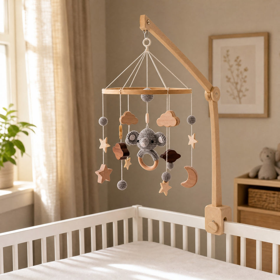
The sage green of the year (Dulux’s Soulful Sage) is probably the easiest to live with: on one wall, with cream walls and light wooden furniture, it makes a fresh, soft room. Our beige celestial mobile, with stars, clouds and a crescent moon below a wooden hoop, in beige, ivory and warm brown tones, fits in naturally.
2. Powder blue, cream and caramel
Powder blue (Valspar’s Cottage Door) brings freshness without feeling cold. Pair it with cream and a touch of caramel, on a cushion or a basket. The blue moon mobile, with its crescent moon, stars and wooden clouds among powder blue and cream beads, matches this palette exactly.
3. Dusty pink and natural linen
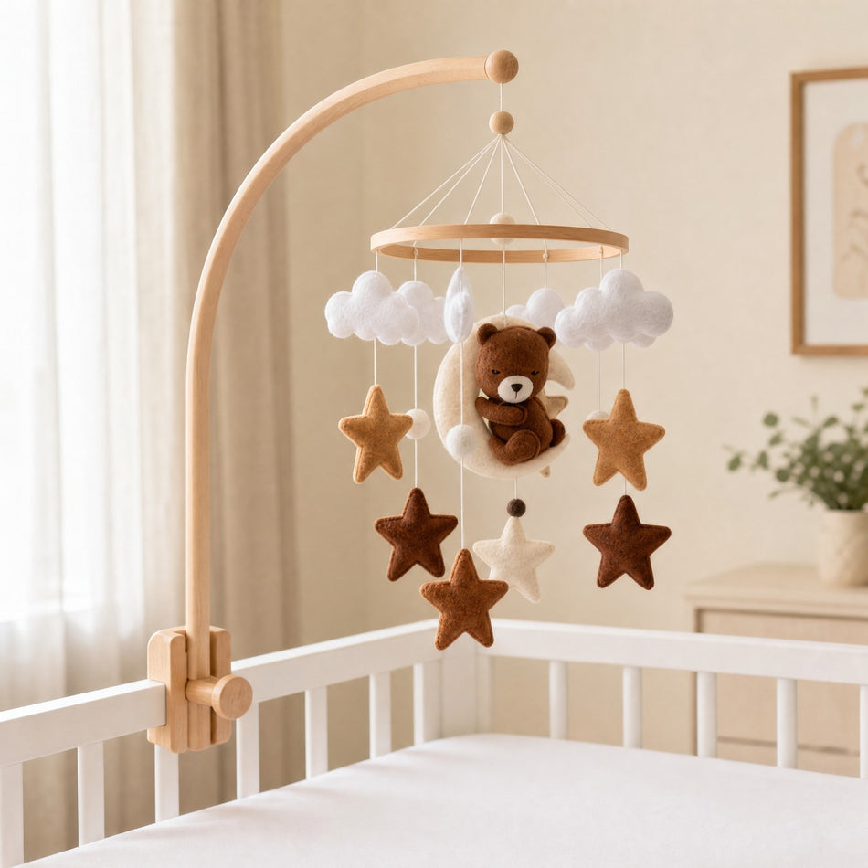
Dusty pink (Graham & Brown’s Rose Earth) is a grown-up, almost beige pink that warms the room. With natural linen, off-white and a touch of caramel, it stays very soft. Our Ourson Céleste mobile, a little bear among the stars in beige, caramel and cloud white, completes the look.
4. Terracotta as a small touch
Terracotta (Dutch Boy’s Deep Rooted) is a strong colour: in a nursery, keep it to a small area, such as the lower part of a wall, a poster or a cushion, with plenty of cream around it. The Petit Explorateur hot air balloon mobile, in cream, caramel and warm brown, goes well with these warm tones.
5. Moss green and off-white
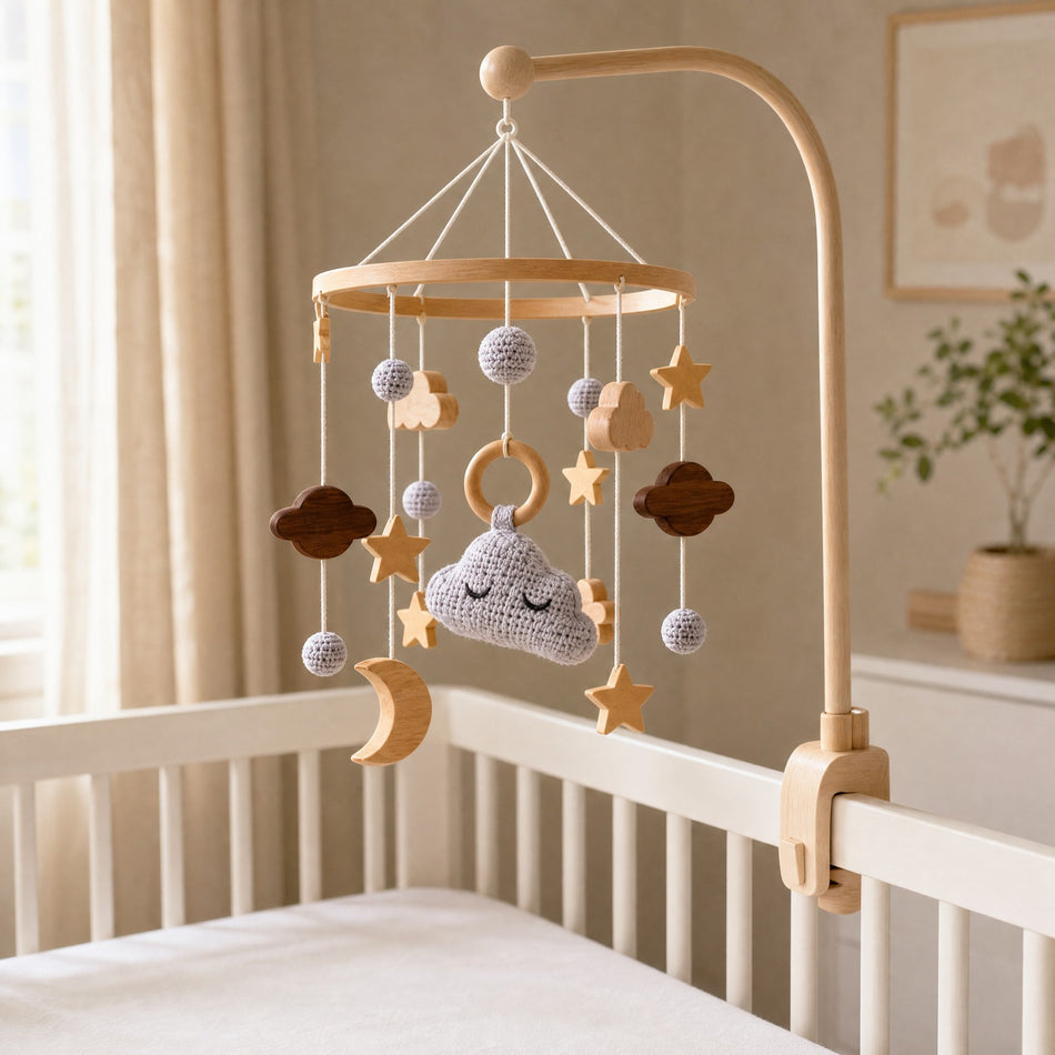
The deep greens of 2027 (Behr’s Grounded, Benjamin Moore’s Webster Green) add character. In a nursery, keep them for a detail: a chest of drawers, a frame, a shelf, and leave the walls around them light. A mobile in neutral tones, such as the sleepy cloud mobile with its soft grey cloud, softens the whole room.
6. Celery green and white, for a cheerful touch
Celery (Sherwin-Williams’ Celery) is the liveliest green of the year. It works in small notes: a frame, a storage box, a cushion cover, against a white or cream background. Keep the rest of the room simple so it stays a cheerful accent.
Using a trend colour without repainting the whole room
A colour of the year changes every autumn; a nursery has to last. A few pointers:
- A light base (off-white, cream, sand) on most walls.
- The colour of the year on one surface only: one wall, the lower half of a wall, an alcove.
- Touches that are easy to change: curtains, cushions, posters, a basket, a mobile.
- A sample tested in the room, in daylight and in the evening: the same green can look very different depending on which way the room faces.
For more ideas, see our 15 nursery decor ideas, our article on the sky-themed nursery and our tips for choosing a calming colour.
Painting the nursery: when?
The French health insurance (Assurance Maladie) advises against planning renovation work at home during pregnancy. If the room has to be prepared, it recommends finishing the work well before the birth, then airing the room for a long time to clear pollutants. Another good reason to bring in the colour of the year mainly through textiles and accessories.
Safety: soft decor around an empty cot
- Baby sleeps on their back, in a sleeping bag suited to their size, on a firm mattress.
- The cot stays empty: no pillow, duvet, blanket, bumper or soft toy.
- The mobile is for looking at: out of reach even with arms stretched out, nothing hanging towards the cot, its attachment checked regularly. Remove it as soon as baby starts to push up on hands and knees, or at around 5 months, whichever comes first.
- Frames, shelves and furniture are securely fixed, and kept away from the cot.
All our pointers are in our nursery safety checklist.
FAQ: 2027 trend colours
What is the colour of the year 2027?
Each brand picks its own. For 2027: Soulful Sage at Dulux, Webster Green at Benjamin Moore, Celery at Sherwin-Williams, Grounded at Behr, Cottage Door at Valspar, Rose Earth at Graham & Brown and Deep Rooted at Dutch Boy. Pantone had not announced its own on 12 November 2026.
Which trend colour should I choose for a nursery in 2027?
Sage green and powder blue are the easiest to live with on a wall. Dusty pink, terracotta and the deeper greens work better as small touches, with a light base.
Is green a good colour for a nursery?
Yes, especially in soft, greyish versions such as sage. It goes with light wood, linen and cream, and works just as well for a girl as for a boy.
How can I follow the trend without repainting?
With textiles, posters, a basket or a mobile: touches that are easy to change as your taste evolves.
Handmade mobiles in natural tones
Beige celestial, blue moon, hot air balloon, sleepy cloud or Ourson Céleste: discover our baby mobile collection to dress a nursery in the colours of 2027. For a complete set, build your pack (a mobile, a music box and an arm) and get €20 off the total. Delivery is free to mainland France, Belgium and the Netherlands, and returns are free for 30 days.
Sources: Homes & Gardens, “Every Color of the Year We Know So Far”; Benjamin Moore, Color of the Year 2027 press release; Pantone, Color of the Year; Assurance Maladie, pregnancy and early childhood: acting on the environment (in French).
0 comments